
How to Build a Scrollable Date Picker in JavaScript
Learn how to design a JavaScript date scroller with continuous navigation, range selection, accessibility, bounded DOM rendering, and a real RollDate Core example.
Most JavaScript date pickers show one calendar month at a time. The user opens the picker, clicks previous or next, and then chooses a day.
A scrollable date picker changes that navigation model. Instead of treating every month as a separate screen, it presents a continuous date surface that users can explore with touch, a mouse wheel, a trackpad, keyboard controls, or explicit navigation buttons.
That sounds like a small UI change. It is not. Once scrolling becomes navigation, the component must handle date state, DOM recycling, scroll anchoring, range selection, focus management, disabled dates, and long-distance jumps without letting those concerns leak into its public API.
This guide explains those decisions and finishes with a runnable RollDate Core example.
Date scroller, date slider, or wheel picker?
These names are often used for different interfaces:
- A scrollable date picker usually presents days in a calendar surface that can move continuously through adjacent weeks or months.
- A date scroller is a broader term and may describe either a calendar surface or separate scrolling columns.
- A wheel date picker normally uses independent day, month, year, or time columns.
- A date slider can mean a horizontal strip of dates, a numeric range control, or simply a date scroller. The term is ambiguous, so the interaction should be described explicitly.
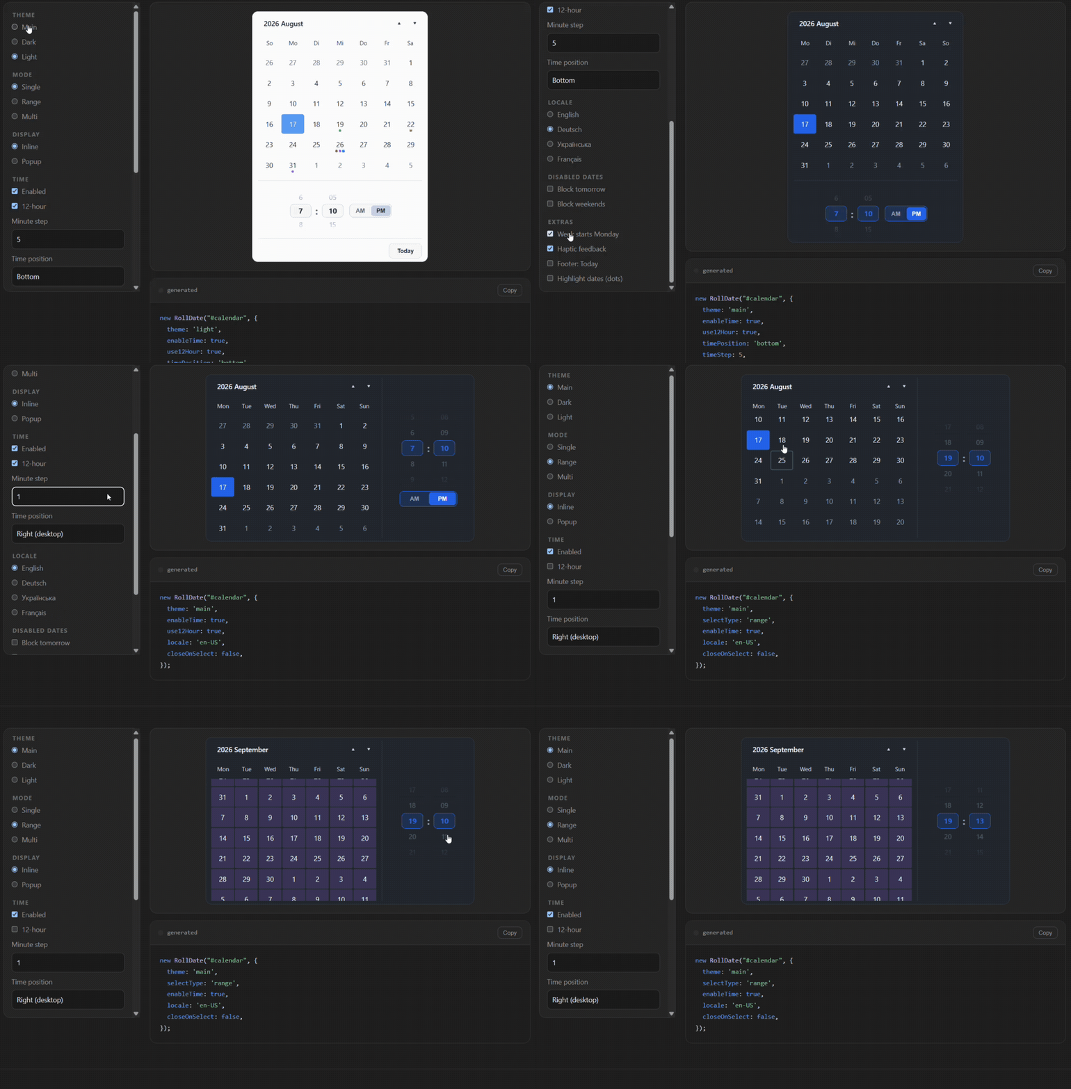
RollDate Core combines a continuously navigable calendar with wheel-style time controls. It is intended for form input: choosing one date, several dates, a range, or an optional time. It is not an event-calendar or scheduling grid.
When continuous scrolling is useful
Scroll-first navigation works particularly well when:
- users often choose dates near the current date;
- a range crosses a month boundary;
- adjacent weeks need to remain visible while comparing dates;
- the interface is used on touch devices;
- repeated previous/next clicks would interrupt the task.
It is less suitable as the only navigation method for distant dates. Selecting a birthday from decades ago by continuously scrolling would be tedious. A robust picker should also provide direct month/year navigation, text input, or an explicit jump.
The practical rule is simple: use scrolling for nearby exploration and a direct control for large jumps.
Keep date state outside the DOM
Do not make .selected elements the source of truth. A scrollable picker may recycle or remove the node that currently represents a selected date.
Keep navigation and selection state separately:
const state = {
  viewDate: new Date(),
  selectedDates: []
}
The DOM is only a projection of that state. A rerender should not change the selected value, and scrolling should not silently commit a new date.
This separation gives the component two predictable actions:
scroll or navigate → change the visible dates
click, tap or Enter → change the selected dates
Generate dates independently from rendering
Date calculations should not depend on existing elements. A generic month generator can return dates first:
function getMonthDays(year, month) {
  const count = new Date(year, month + 1, 0).getDate()

  return Array.from(
    { length: count },
    (_, index) => new Date(year, month, index + 1)
  )
}
Rendering becomes a separate step:
function renderMonth(year, month) {
  const fragment = document.createDocumentFragment()

  for (const date of getMonthDays(year, month)) {
    const button = document.createElement('button')

    button.type = 'button'
    button.dataset.date = toDateKey(date)
    button.textContent = date.getDate()
    fragment.appendChild(button)
  }

  return fragment
}
Use a stable local calendar key instead of a locale-formatted label:
function toDateKey(date) {
  const year = date.getFullYear()
  const month = String(date.getMonth() + 1).padStart(2, '0')
  const day = String(date.getDate()).padStart(2, '0')

  return `${year}-${month}-${day}`
}
The snippets above demonstrate architecture; they are not RollDate API methods.
Bound the amount of rendered content
The naive implementation appends another month whenever the user approaches the end of the container. It works until dozens of old months remain mounted.
A better model keeps a bounded window:
previous segment
current segment
next segment
When navigation moves forward, the previous segment can be removed, the remaining segments can be shifted, and a new next segment can be generated. The visible timeline remains continuous while the amount of live DOM stays controlled.
This is the same principle used by virtualized lists: keep the state needed to recreate content, but mount only what the user needs around the viewport.
Preserve scroll position while recycling
Removing content above the viewport changes scrollTop. If a removed region is 600 pixels high, everything below it shifts upward by 600 pixels.
At a conceptual level, compensate for the removed height:
const removedHeight = previousSegment.offsetHeight

previousSegment.remove()
container.scrollTop -= removedHeight
Production code also needs to account for layout timing, responsive widths, different month heights, fonts, and browser behavior. The requirement stays the same: recycling the DOM must not produce a visible jump.
The same principle applies when date rules change. If the structure is unchanged, update disabled and selected states on the existing day buttons instead of rebuilding the whole calendar.
Range selection across months
A range is state, not a collection of highlighted nodes:
const range = {
  start: new Date(2026, 8, 28),
  end: new Date(2026, 9, 4)
}
Each visible day can be classified as the range start, range middle, or range end. The full range does not need to remain mounted.
Normalize values before comparing calendar days so that different time components do not change the result:
function startOfDay(date) {
  return new Date(
    date.getFullYear(),
    date.getMonth(),
    date.getDate()
  )
}

function isInsideRange(date, start, end) {
  const value = startOfDay(date).getTime()

  return value >= startOfDay(start).getTime()
    && value <= startOfDay(end).getTime()
}
Test cross-month and cross-year ranges explicitly. They reveal assumptions that same-month examples hide.
Availability rules need a clear priority
Booking and reporting interfaces often need more than a list of disabled days. They may allow only weekends, a business schedule, or dates returned by an application callback.
A predictable rule order is:
minDate / maxDate
        ↓
enabledDates allowlist
        ↓
disabledDates denylist
The final denylist makes exceptions possible: allow every weekend, then block a specific holiday.
Changing those rules at runtime should update visible day states in place. Synchronize the CSS class, native
disabled attribute, aria-disabled, selected state, active keyboard date, and
roving tabindex. Changing only the color produces an element that looks disabled but can still
be reached or activated incorrectly.
Native scrolling is usually the right starting point
Avoid replacing browser scrolling with a large pointer-drag implementation unless the product genuinely needs custom physics.
Native scrolling already provides touch gestures, wheel and trackpad input, momentum, and platform-specific behavior:
.date-scroller {
  overflow-y: auto;
  overscroll-behavior: contain;
  -webkit-overflow-scrolling: touch;
}
Scroll snapping can help when rows should settle into predictable positions, but aggressive snapping can make exploration frustrating. Test on real touch hardware; a desktop mouse wheel is not a reliable substitute.
For more on why this fits phones, see Why Scroll-First Date Pickers Work Better on Mobile.
Accessibility survives virtualization
Day cells should be real interactive elements:
<button
  type="button"
  aria-label="September 18, 2026"
  aria-pressed="false"
>
  18
</button>
A scrollable picker still needs:
- visible focus styles;
- arrow-key navigation;
- Enter or Space for selection;
- clear disabled and selected states;
- Escape behavior for a popup;
- focus restoration when the popup closes;
- a deliberate focus target if virtualization removes the active element.
Roving tabindex keeps one day in the grid reachable with Tab while arrow keys move inside the
grid. If an availability update disables the active day, move the active state to an available date before
synchronizing tabindex.
A real RollDate Core range example
Install the package:
npm install @rolldate/coreAdd an input:
<input id="booking-dates" type="text" autocomplete="off">Then initialize a range picker using the actual RollDate Core API:
import RollDate from '@rolldate/core'
import '@rolldate/core/styles'

const picker = new RollDate('#booking-dates', {
  selectType: 'range',
  startWeekFromMonday: true,
  minDate: '2026-09-01',
  maxDate: '2026-12-31',

  // Allow Monday through Friday.
  enabledDates: [
    { repeat: 'weekly', weekdays: [1, 2, 3, 4, 5] }
  ],

  // The denylist wins over the allowlist.
  disabledDates: ['2026-12-25'],

  selectDate(value) {
    console.log(value)
  }
})
The availability rules can change without recreating the picker:
picker.setEnabledDates([
  { repeat: 'weekly', weekdays: [0, 6] }
])
Other runtime methods keep navigation separate from selection:
picker.goToDate('2026-11-01') // navigate without selecting

const value = picker.getValue()
const visibleDate = picker.getViewDate()
const visibleMonth = picker.getViewMonth()

picker.setValue([
  new Date(2026, 10, 6),
  new Date(2026, 10, 9)
])
getValue() returns the committed selection. getViewDate() and
getViewMonth() describe the current viewport. That distinction is what prevents browsing from
silently changing a form value.
Try the live demo, experiment in the playground, or read the Core documentation.
What to test
At minimum, cover:
- range selection across two months and two years;
- min/max boundaries;
- an empty allowlist;
- allowlist and denylist conflicts;
- weekly and monthly recurring rules;
- runtime rule changes while a date is selected;
- keyboard navigation after the active day becomes disabled;
- closing with Escape and restoring focus;
- large navigation jumps;
- scroll anchoring when segments are recycled;
- narrow containers on desktop and real touch devices.
These tests exercise the interaction model, not just date formatting.
Final thoughts
A scrollable JavaScript date picker is not simply a calendar inside overflow: auto.
The durable architecture is built from a few separations:
- selection state is independent from rendered nodes;
- date generation is independent from DOM creation;
- visible dates are independent from committed values;
- continuous navigation is independent from unlimited DOM growth;
- visual disabled states stay synchronized with native and ARIA states;
- public date methods do not expose the internal virtualization strategy.
Once those boundaries are clear, scrolling can remain smooth, ranges can cross rendering boundaries, and the implementation can evolve without breaking the API used by applications.